Introduction
Since AI isn’t going away, is there value in incorporating it into our creative processes?
In my Transformation project, I take a hybrid approach:
In the first step, as the creator, I transform a ‘real’ abstract photograph into a composition of lines, shapes, and colors. This approach was inspired by photographs that @alxbtz_ recently shared on Instagram.
In the second step, an AI image-to-video algorithm generates a 10-second video sequence using the start and end image of Step I, guided by a text prompt.
The AI’s results are random. With every new attempt, the outcome differs from the previous one, even when the exact same prompt is used. While this unpredictability might be undesirable in some contexts, it has led to surprising and inspiring results in my Transformation project.
The downside of this approach is that our art likely becomes part of AI training data (if not ruled out by the terms and conditions of the service). Over time, these systems may generate outputs that echo our styles or ideas, contributing to a homogenization of creativity and potentially diminishing the value of human-made art. For me, this project is a double-edged sword: a fascinating experiment, but also a reminder of the ethical dilemmas we face as creators. That’s why I advocate for the very selective use of such tools, with full awareness of their broader implications.
Side note: Some providers are removing the random component of the algorithm by using seeds (fixed numerical values, e.g., 42 or 12345). By using the same seed with identical prompt and model settings, you can reproduce nearly identical results.
Transformation — Part I
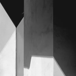
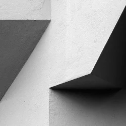
STEP I
In the upper left corner, the original photograph is displayed, while the final composition of lines, shapes, and colors appears in the lower right.
The interim images reveal the creation process: First, I apply black lines to the transparent original photo, capturing the leading lines of the image. What remains is a network of black lines, which I then expand with my own shapes and colors.
The Design was inspired by the De Stijl movement.
No AI involved.
STEP 2
The video captures the entire creation process, including the AI-generated transformation from the original photograph to the final composition of lines, shapes, and colors (37th second+). As mentioned earlier, the result is random; guided only by the start image, the end image, and a text prompt that I prepared. With music made by Mike Cross Jung & myself.
Transformation — Part II
STEP I
This composition draws inspiration from the sky. Its stars, planetary constellations, and the patterns they create in celestial maps.
No AI involded.
STEP 2
The video captures the entire creation process, including the AI-generated transformation from the original photograph to the final composition of lines, shapes, and colors (37th second+). As mentioned earlier, the result is random; guided only by the start image, the end image, and a text prompt that I prepared. With music made by Mike Cross Jung & myself.
Transformation — Part III
STEP I
This piece uses colour gradients to create a harmonious composition, blending hues into a seamless visual flow. While the graphic’s background uses soft pastel tones, the circles are deliberately more vibrant. The circles arrange to hint at a triangle, while a bold line divides the space, separating warm tones from cool.
No AI involded.
STEP 2
The video captures the entire creation process, including the AI-generated transformation from the original photograph to the final composition of lines, shapes, and colors (37th second+). As mentioned earlier, the result is random; guided only by the start image, the end image, and a text prompt that I prepared. With music made by Mike Cross Jung & myself.